Interaction Design
for NASA
Development of the Environmental and Life Support System interface for deep space missions.
The Challenge
Ensure that astronauts are able to monitor and repair the environmental control and life support system used during deep space missions in potentially life-threatening situations and without access to systems experts.
The Outcome
A touchscreen interface design that supports astronauts through data exploration and the decision-making process when a fault has occurred. The design is extensible across all four functional units and considers future technology enhancements, including augmented reality.
Project Overview
UTC Aerospace Systems (now Collins Aerospace) came to the Bentley User Experience Center with a new project to design the interface for the environmental control and life support system (ECLSS) to be used by NASA during deep space missions.
In the first phase of this project, we worked on a touch screen interface that astronauts would interact with to troubleshoot and solve problems related to the four functional units that make up the ECLSS. In order to create a successful user experience, we were tasked with creating a single interface that was extensible and would work across those four units.
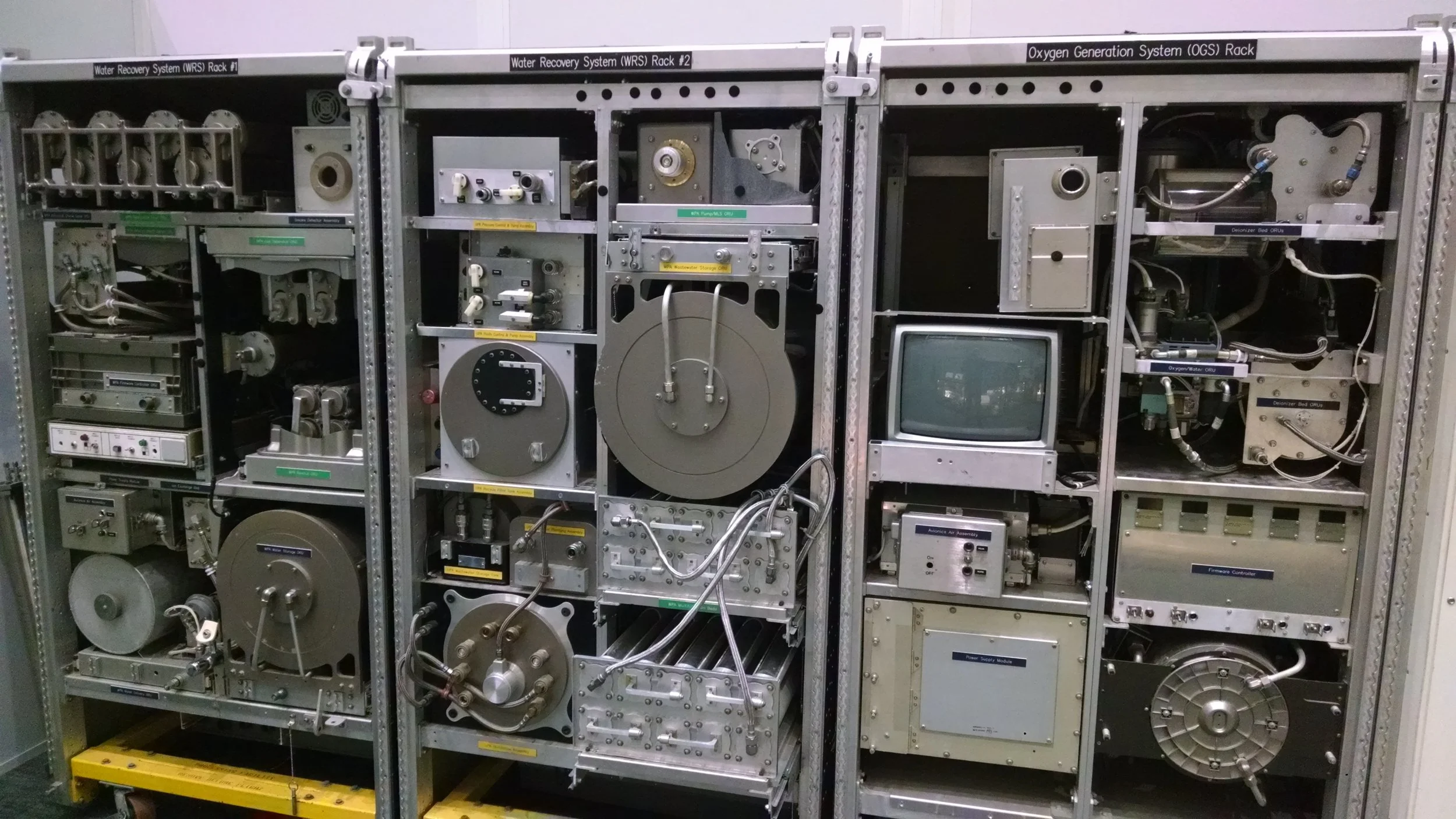
Environmental Control and Life Support System used in the International Space Station
DESIGN CHALLENGES
Communication Barrier
During deep space missions astronauts will have a large time delay when communicating with mission control. This delay means that if something goes wrong with the ECLSS, astronauts will need to be able to fix the potentially life-threatening issue themselves with no support from on-the-ground experts.
Intelligent System, Intelligent Human
Without experts on hand, the system needs to aid users in issue identification and walk them through detailed steps to address and fix the issue. However, our research found that astronauts may not trust the system early in use, instead wanting to rely on their own expertise. Due to this, astronauts need to be able to operate independently of the system if they do not agree with the identified cause of the issue.
Approach
Proto-personas & Journey map > Fault decision tree > interaction and visual design
Proto-personas and Journey Maps: Creating Empathy and Understanding
In order to build a better understanding of the users and the interface, we began the project by developing proto-personas and a journey map. Due to the relationship between UTAS and NASA, we were unable to speak directly with our users (astronauts) during the first phase of the project. Therefore, we spent a considerable amount of time researching the existing literature, from astronaut biographies to ethnographic studies from space, along with the behavioral characteristics that NASA uses when recruiting. These proto-personas were then used to create journey maps detailing an astronaut’s experience with the ECLSS from non-scheduled data exploration to receiving an alert, diagnosing the issue, and putting a fix in place.
Fault Decision Tree: Developing the Underlying Structure
After this first phase was reviewed and signed-off on by project stakeholders familiar with the system and users, we began work on a fault decision tree outlining the various options that an astronaut would have when troubleshooting issues with the system. The goal of this phase was to develop an optimized underlying structure for the system, enabling the identified user groups to quickly and effectively navigate through the system.
Prototyping: An Iterative Process
With this information in hand, we began an iterative design process. Beginning with paper prototypes, our team of three iterated on various designs that would allow astronauts to explore available data on the ECLSS in a nominal state and diagnose and fix any issues that may occur. As we began to zero-in on the overall design, we created interactive wireframes with Axure.
As a team we investigated how the four primary systems would interact to determine how this would influence the overall design.
With an understanding of the system and our users, we developed a journey map showing our proto-personas’ journey through both the nominal and fault states of the system.
We then created a fault decision tree based on our research which outlined which actions the user and system would take and how they impacted each other.
Solution
We designed a touchscreen interface that would support astronauts through their two primary use cases, data exploration during a nominal state as well as the decision making process when a fault has occurred. Key design considerations included:
Wizard to Guide Users
In order to reduce cognitive load, a wizard was used to guide users through the fault process. Users can, however, easily jump in and out of the wizard to diagnose a fault on their own or further explore data.
Redundant Signals
There are redundant signals available throughout the system that will aid a user in their ability to complete a task, particularly in the instance that one stimulus is ignored or degraded. This is accomplished through the use of both visual and auditory features, which enable the user to give verbal commands to the system and have the system read data back or verbally go through a protocol.
Data at a Glance
The data visualizations available on the ‘home screen’ during the nominal state are designed in a simplistic way so that a user can quickly go by the screen and see the overall health of the system. If they would like to take a closer look at the data itself they click on the graph or go into the data visualization feature.
Consistent Iconography for Quick Identification
Each functional group has a unique icon in the top right in addition to the title of the functional group across the top of the screen. This will remain consistent throughout navigation and the icon can also be used in print materials for further consistency.
Energy Conservation
The screens primarily use dark colors as a way to help conserve energy. Dark backgrounds with light text are additionally easier for the human eye to look at for long periods of time.
Our final deliverable included 20+ interactive wireframes which represented key screens in the system.


